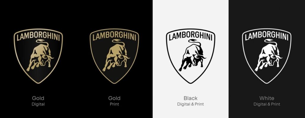
Legendary Italian automaker Automobili Lamborghini unveils a revamped Lamborghini new logo and visual identity, reflecting a commitment to innovation and a sustainable future.
For over two decades, the Lamborghini logo has been a symbol of audacious design and unparalleled performance. Now, the raging bull gets a refresh, ushering in a new era for the brand.
Lamborghini New Logo with “Direzione Cor Tauri”
This logo redesign coincides with Lamborghini’s “Direzione Cor Tauri” strategy, a roadmap for the company’s future focused on sustainability and environmental responsibility. The new visual identity reflects the brand’s core values of being “brave,” “unexpected,” and “authentic,” while emphasizing its commitment to “Driving Humans Beyond.”
Subtle Sophistication: The New Logo

The iconic bull remains the centerpiece, but with a sleeker, more modern look. The Lamborghini typeface has been broadened, and a bolder color palette featuring black, white, yellow, and a new gold accent color takes center stage. The shield surrounding the bull takes a backseat in the digital world, allowing the bull to stand out with even greater prominence.
A Cohesive Brand Experience
The transformation extends beyond the logo. A Lamborghini New Logo typeface, inspired by the sharp angles of their cars, will be used across all communications. Additionally, a new set of icons, developed in collaboration with Lamborghini Centro Stile, ensures a consistent brand experience across all digital touchpoints.
Lamborghini’s Bold Move Towards the Future
This strategic shift in visual identity perfectly complements Lamborghini’s commitment to a sustainable future. The new logo embodies innovation and determination, marking a new chapter for the legendary brand.
Source: https://www.lamborghini.com/


